


Tuesday 30 March 2010
Evaluation!
Sunday 28 March 2010
How effective is the combination of your main product and ancillary texts?
We were aware how important it was to have a consistent design, therefore we included the gritty background on both the blog and website creating continuity between products. As the templates on blogger didn't match what we were looking for we teamed a different template with our background to create the right mood.

We used links to the website to the blog and visa versa to make it easy for the reader to see all aspects of our project, we used a widget on Blogger to do this and simple links on Wix.
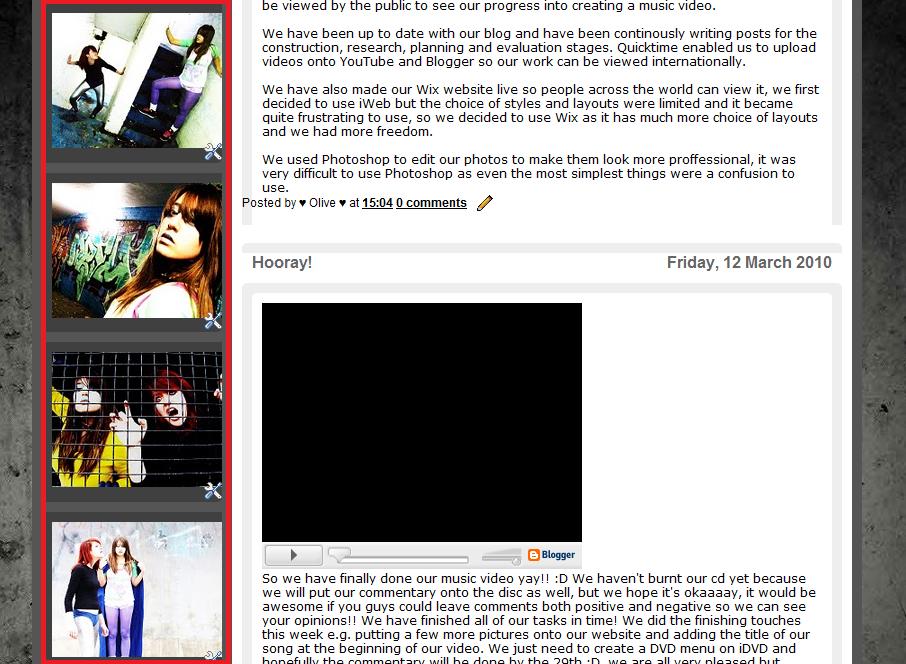
To link all the tasks visually we used widgets at the side of the blog to show the pictures we took on filming days, these are included on the website and digipack booklet. They prove effective in linking our music video to the blog as they serve as snapshots, compelling the reader to watch the final product.
The Prodigy fits into a dance/electronic genre. Their dark and gritty style is included in all our products an examples of this is the black and grey palette. To link our media product to the real Prodigy’s music and branding we included the ant they use frequently. I first noticed this reference when researching their past albums, http://roadmusicvideo.blogspot.com/2009/11/ancillary-task-cd-cover-design_06.html. Therefore using a bit of old school Microsoft Paint I managed to put this onto the ROAD sign to incorporate their conventional designs.
The dance genre usually connotes colour, something we've included in using yellow for the icons on the website. Whilst this is generally bare from our layouts in both products we were sure to keep our pictures mostly in colour to give a vibrant edge. 
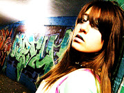
Our CD cover is a picture of Olivia with her hand towards the camera, as if reaching out to the potential audience. Whilst The Prodigy has a tendancy to go for more artistic design approaches, we felt using a picture straight from the filming days made a more interesting cover. As this cover can be found on both the blog and website it means they all interlink. Once again we have incorporated the offical Prodigy name art & title design linking the real band.

The website and blog look appealing as they have colourful pictures and no block writing making them inviting to read.

In what ways does your media product use, develop or challenge forms and conventions of real media products?
My Question: In what ways does your media product use, develop or challenge forms and conventions of real media products?
We spent a lot of time in pre-production watching over previous Prodigy music videos from a DVD I bought, we concluded that a lot of their music videos were quite dark and had the grey/ urban/ industrial setting that we tried to include in our final video. Although, their new album, ‘Invaders Must Die’ is more mainstream than their previous albums so we could take more of a risk in what we tried to create in our video, as we had a wider target audience to play with.
By following Goodwin’s Six we established that the most important concept we had to follow was the Music to Visuals, even though there aren’t many lyrics we still used them to influence the narrative, bringing in a teacher to play the part of the ‘Boss’ for the protagonist which was really effective as we used lip syncing to make the line sound like it was coming from him.
Our music video was narrative/ performance based therefore we deliberately picked out a dance student and used her as the main character, something that proved effective when receiving audience feedback.
Friday 19 March 2010
What have you learned from your audience feedback?
• What have you learned from your audience feedback?
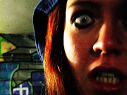
To receive audience feedback, we decided to run a focus group at a lunch time. We asked several of our fellow students, not necessarily students that are studying media studies, to come and preview our music video and give us feedback. We also showed them our digi pack to receive audience feedback on that as well. To further our audience feedback we also asked our friends from social networking site Facebook, to view our music video on YouTube and their opinions on it. During the focus group a student found that the music to visuals synchronisation was something that caught their eye. It felt good to hear that it was noticed and enjoyed, as we focused heavily on incorporating this element of Goodwin’s six conventions of music video, into our own project. An improvement that was discussed amongst the group was the realism of the fight scene which they said looked staged and slightly amateur. This was something we tried to combat when filming, but obviously we did not want to harm our actresses too much, so restrictions were in place. Camera movements which the group enjoyed were the contra zoom’s used in the fight scene, which was a key part of the “western” style standoff, and possibly the most complex piece of camerawork in our whole project. The editing technique of shooting Olivia in reverse motion, the group thought was very amusing and thought it fitted our genre completely. Comments on mise en scene were that they loved the cape, especially in the slow motion shots and also the contrast of Olivia’s hair and the scary eye lenses. Finally, most of the group commented that they could follow the narrative of the music video easily and that it was a very fitting storyline, with a different concept idea that they enjoyed. They commented on how there was a clear progression throughout the video and the build up to the fight scene was intense.
Thursday 18 March 2010
How did you use media technologies in the construction and research, planning and evaluation stages?
Friday 12 March 2010
Hooray!
Monday 8 March 2010
Finished CD Design

As you can see it has a simplistic theme, something when we reviewed it we felt didn't reflect our genre and band.
Today me and Danielle spent all lesson & lunchtime & sadly, after school aswell making our cd design, it's now compelete and here are the pictures :)
When templates failed on us, we ended up finding the right sizes through trial and error, taking ages and using up lots of trees - but we recycled! :)
Eventually we got there, and printed it off in colour.
 We took lots of photos on the filming days whilst Olivia and Vicky were in costume which left us with lots of great material for a booklet.
Mozza suggested we put the 'cage' photo of Olivia and Vicky under the CD to create an edgy feel, something we feel was rather effective.
The front cover was designed by Roish using Photoshop, we were keen on the idea of using the close up hand from early on in our planning, which we blogged in December.

We were rather happy with our first draft.. even though it was slightly mishaped and in black and white!
So we're all done, just got to burn our video to the CD!! Woo!
Final, FINAL photo's coming soon...